 |
| How to Make a Lightweight Mini Slider in Blog Posts |
This slider can be lightweight because it only relies on the click effect on the left and right buttons and also moves with the scroll method, which is why this slider also has a scroll at the bottom to make it easier for visitors to choose whether to use the button or scroll.
Light, but still comfortable in responsive mode, because it can slide left and right without having to press the arrow keys. The size of images that can be installed also varies, horizontal or vertical does not matter.
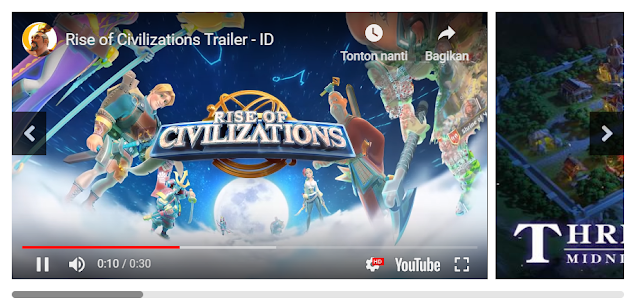
Put Video and Image in 1 slider? no problem, everything works smoothly on this mini slider. (btw The videos and pictures in this post are not advertisements, just examples 😁).
Info: This tutorial is equipped with a short video at the end of the post.
It should be noted, at least you know the opening and closing tags in HTML and try not copy and paste articles from Microsoft Word or other sites.
Follow the tutorial below to install the Mini Slider on your blog post:
Go to Blogger> Themes> Edit HTML
Put the following CSS Style directly above the code ]]></b:skin> or </style>
/* CSS Blanter Mini Slider */
.slide-wrap{margin:30px 0;overflow:hidden;position:relative}
.slide-wrap ul li a img{height:309px;width:100%}
.blanter-wrap{overflow:hidden;overflow-x:scroll;position:relative;width:100%;height:330px}
.slide-wrap ul{position:absolute;list-style:none;padding:0;margin:0}
.slide-wrap li{white-space:nowrap;list-style:none;padding:0;margin:0}
.slide-wrap iframe{width:100%;height:87%;background:#000}
.slide-wrap ul li a{cursor:auto;padding-right:0!important;margin-right:5px;display:inline-block;vertical-align:middle;position:relative;max-width:550px;height:355px;background-position:center;background-repeat:no-repeat;background-size:cover;-moz-background-size:cover;-webkit-background-size:cover}
.slide-wrap ul li a.youtube-iframe{width:550px}
.slide-wrap ul li a:last-child{margin-right:0}
a.right-b{right:0}
a.left-b svg,a.right-b svg{width:15px;margin:10px 0 0}
a.left-b,a.right-b{position:absolute;top:35%;width:40px;line-height:50px;height:50px;text-align:center;color:#fff;background:#000;opacity:.7;transition:all 0 ease-in-out}
a.left-b:hover,a.right-b:hover{opacity:1}
.blanter-wrap::-webkit-scrollbar{width:8px;height:8px;border-radius:10px}
.blanter-wrap::-webkit-scrollbar-track{background-color:rgba(0,0,0,.1);border-radius:10px}
.blanter-wrap::-webkit-scrollbar-thumb:hover{background-color:rgba(0,0,0,.6)}
.blanter-wrap::-webkit-scrollbar-thumb{border-radius:2px;background-color:rgba(0,0,0,.4);transition:all 400ms ease-in-out;border-radius:10px}
Put the following script directly above the code </body>
<script type='text/javascript'>
//<![CDATA[
// Scroll
$('a.right-b').click(function() {
  $('.blanter-wrap').animate({
    scrollLeft: "+=500px"
  }, "normal");
});
 $('a.left-b').click(function() {
  $('.blanter-wrap').animate({
    scrollLeft: "-=500px"
  }, "normal");
});
//]]>
</script>
Save Template.
Next, please go to Edit Post > HTML Mode > Put the following code where you want.
<div class="slide-wrap">
<div class="blanter-wrap">
<ul>
<li>
<a class="youtube-iframe" href="javascript:void(0)">
<iframe allow="autoplay; encrypted-media" allowfullscreen="false" frameborder="0" src="https://www.youtube.com/embed/03qDL0Xp2Lw?rel=0&showinfo=1"></iframe>
</a>
<a href="javascript:void(0)">
<img alt="Judul Gambar" src="https://blogger.googleusercontent.com/img/b/R29vZ2xl/AVvXsEh8IjalZm6_6fycnY99RhJSM6yoZRkj_DOB8VJYR_iL0-012C3NxX8gyP_cH7bsG4XABcUbX85OHDdoHssp4YUFe72F5eUIo9HEGjdoQ7aS6aI8cWJWyYj2i5BI6lt2SO7MjOSjZSJcPyg/s1600/RoC.jpg" title="Judul Gambar" />
</a>
<a href="javascript:void(0)">
<img alt="Judul Gambar" src="https://blogger.googleusercontent.com/img/b/R29vZ2xl/AVvXsEgYsLla_em3VNa17e6c0JWQ3bFIAZ-_Hc-NbsOZIC9Bfvl0vkH45kC3I79ffcrTVtf-FvNh5oZB8dv_HxWS98LZBg98zSOpKvK73RIwEOUDdPRJ0Bk2t0us4qO2i8S4r2cm2fRyhZ13q_s/s1600/RoC2.jpg" title="Judul Gambar" />
</a>
<a href="javascript:void(0)">
<img alt="Judul Gambar" src="https://blogger.googleusercontent.com/img/b/R29vZ2xl/AVvXsEi94OKrJENL2rTENM7tuQP5Bviw6j050qEftjYQ1LMGNLD26g6RtsFaLH-VKn5TIdlEytsqAM6kTnKNY0-ZsPQUrzihniKes_hrLT-geAU18D2-8s49vf8_ZF0gqoRHo1bmGt4Hzj5iwfI/s1600/RoC3.jpg" title="Judul Gambar" />
</a>
<a href="javascript:void(0)">
<img alt="Judul Gambar" src="https://blogger.googleusercontent.com/img/b/R29vZ2xl/AVvXsEivJkJIuJt-IHsY00BbeV14v3fqEf4U_tavntCt1Wnt7-poahlNxoNXjGaDgcb_ZSXaejBLqBOeDQG02EIhuHdcjVDQAIFD_p3dQHhGF0JWbl5GWo7goorsDX4KLRuzw8Ds6opwUQXRcrw/s1600/RoC4.jpg" title="Judul Gambar" />
</a>
<a href="javascript:void(0)">
<img alt="Judul Gambar" src="https://blogger.googleusercontent.com/img/b/R29vZ2xl/AVvXsEis94FI5ydLN9iEuu3QE77Za1SxwzuMCKvVw3tG-TPvG1s4V9wFGx08zkeImKBGI2YF1PnRKFL7zLyr28e1bfPh68WMdWNDPmrFbLhuLz9RJRy4xWU63jGO2kgsdbaDU5p-exBBjUJIokA/s1600/RoC5.jpg" title="Judul Gambar" />
</a>
</li>
</ul>
</div>
<a class="left-b" href="javascript:void(0);">
<svg aria-hidden="true" data-prefix="fas" data-icon="angle-left" class="svg-inline--fa fa-angle-left fa-w-8" role="img" xmlns="http://www.w3.org/2000/svg" viewBox="0 0 256 512"><path fill="currentColor" d="M31.7 239l136-136c9.4-9.4 24.6-9.4 33.9 0l22.6 22.6c9.4 9.4 9.4 24.6 0 33.9L127.9 256l96.4 96.4c9.4 9.4 9.4 24.6 0 33.9L201.7 409c-9.4 9.4-24.6 9.4-33.9 0l-136-136c-9.5-9.4-9.5-24.6-.1-34z"></path></svg></a>
<a class="right-b" href="javascript:void(0);">
<svg aria-hidden="true" data-prefix="fas" data-icon="angle-right" class="svg-inline--fa fa-angle-right fa-w-8" role="img" xmlns="http://www.w3.org/2000/svg" viewBox="0 0 256 512"><path fill="currentColor" d="M224.3 273l-136 136c-9.4 9.4-24.6 9.4-33.9 0l-22.6-22.6c-9.4-9.4-9.4-24.6 0-33.9l96.4-96.4-96.4-96.4c-9.4-9.4-9.4-24.6 0-33.9L54.3 103c9.4-9.4 24.6-9.4 33.9 0l136 136c9.5 9.4 9.5 24.6.1 34z"></path></svg></a>
</div>Save.
Post a Comment